A thorough UX analysis is part of the solution
Last week I read the excellent “Decomposing CRUD to a Task Based UI” by Derek Comartin. Go and read it if you haven’t done so yet.
There is also a lot of exciting material on Derek’s YouTube channel.
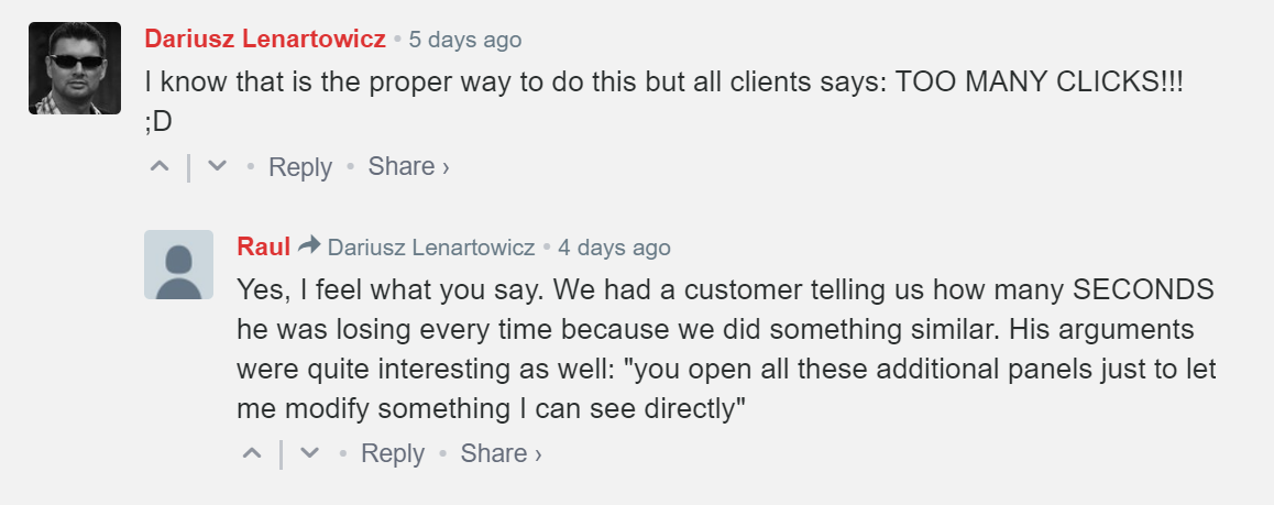
I firmly believe that a task-based user interface (UI) is a natural follow-up to my recent “Do not trust the user mental model: Model behaviors, not data”. The behavior modeling naturally leaks into the UI, and a task-based one is a perfect answer. The problem then shifts to the user, and I’ve heard comments like the following many times myself from customers:

Derek proposes a legitimate solution that exposes its flank to critiques like the above ones, fair.
How do we get out of the impasse?
We can solve the deadlock by offloading the problem to someone specialized in solving these kinds of puzzles: A user experience (UX) architect.
I’ve worked in the past with a couple of UX architects, and I’ve learned that I’m so ignorant on the topic that I better not try to solve any problem in the UX space. For example, the first thing they indoctrinated into me is the difference between efficiency and effectiveness and how we can use them to achieve different goals.
Let me give you a brief sample:
A medical record information system can be intentionally designed to be inefficient to gain effectiveness.
Yes, you got it right. Friction is artificially added to the design to make so that personnel filing medical records pay closer attention to what they do. An efficiency-based system comes with the risk of filling pieces of information mechanically without paying attention, with more significant risks for patients.
On the other hand, there are systems where it’s essential, or we prefer, to favor efficiency because we can fix errors at a later point in time without incurring high costs or risks. That is the case for an accounting data entry system where there might be a preference for quantity vs. quality. (I’m not here to debate if this is a good approach or not.)
The UX architect’s role is not to design the user interface; it’s more to analyze behaviors and organize the information flow. How do people interact with data? What kind of actions do they expect? What sort of efficiency do they need? And so on. The results will then feed into the user interface design process.
Surprise! There is no save button
Sometimes results are surprising; I remember when the UX architect presented the design that we then implemented.
Using Derek’s sample as a foundation, we had to implement a data entry section of the system to create new products. Instead of having multiple screens, or modals, or flyovers, to input different parts of the data, the design team came with the proposal the data entry folks were waiting for: a traditional data-entry table-like user interface. The trick was well hidden in the implementation. The HTML layout had multiple forms, each group of data (grouped by task) had its HTML form, and a not-so-complex JavaScript script was executing backend behaviors on lost focus events. When users were moving the focus from the set of controls in a form to a control in a different form on the same page, the script was:
- Executing client-side validation logic
- Invoking server-side business logic
On the page, there were two buttons: a “Done” button and a “Cancel” button. They redirect back to the previous page; before doing that, the “Done” button executes all client-side validation logic to guarantee data consistency and signals the backend to confirm the draft data. The “Cancel” button signals to the backend to discard the draft data. In case of a browser crash or connection loss, or worse, the design came with a handy surprise: data is there in a draft state, and users can recover from unexpected events and finish their task without starting over.
If you’re old like I am, you probably used Microsoft Access; when designing forms in Access there was no save concept; Access used, and maybe still uses today, a cursor to handle data, changing something on a form meant changing it in the database. For younger people, a Google Spreadsheet behaves more or less in the same way; there is no need to hit the save button, that in fact doesn’t exist.
Conclusion
A task-based user interface is a natural follow-up to a system designed to model behaviors. However, a task-based UI comes with its challenges. Users might find their efficiency diminished by the new style of the user interface. It’s crucial to involve the right expertise to help design an experience that embraces the behavior modeling approach used in the backend and respects users’ requirements. If you find yourself in such a situation, a user experience architect is the expert for you.
Photo by Edgar López on Unsplash